

The Ministry of Health publishes a wealth of Covid-19 data every day, and better yet, they make the information easy to interpret.
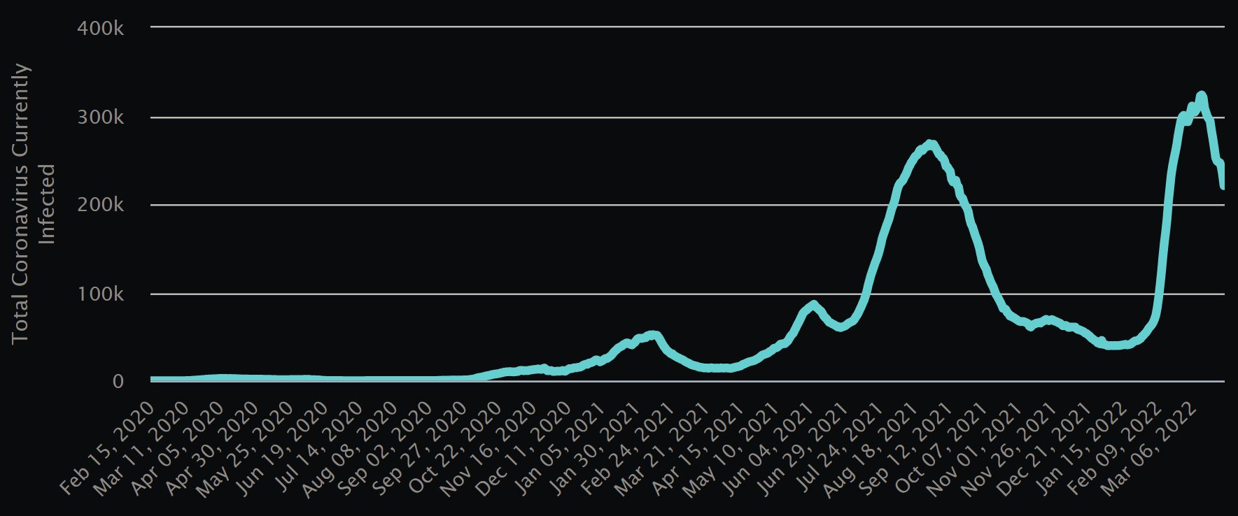
The coronavirus variant known as Omicron was first detected in Malaysia in late November, but didn’t really begin making its presence well-known until late January and early February. At that time, public health officials predicted the wave would reach its peak around mid- to late March. By the first half of this month, experts amended that forecast slightly, saying that Malaysia could expect a downward trend in the latter half of March.
This isn’t mere guesswork; simply put, they can look at the rates of infection and, when combined with other data points generated by the pandemic, infer certain things, often fairly accurately. Of course, any epidemic outbreak remains a biological phenomenon at its core, and also a sociological one to a lesser extent. Biology and human behaviour are two notoriously challenging things to assess and predict, so there’s always bound to be an inherent margin of error in any pandemic prediction.

However, in this case, the forecast made by health officials appears to be accurate. While there has been plenty of variance in daily new cases and hospitalisations in the last two weeks or so, the overall trend has been tenuously declining – so tenuous, in fact, that making the call that the worst was behind us was a hard one to make.
Now, we seem to at last be more solidly heading in that direction. One of the most useful “at a glance” tables on the Ministry of Health’s CovidNOW website, which is full to the brim of data, charts, graphs, and tables, is its Summary, helpfully titled… you guessed it, “At a Glance.”
This table is both easy and useful to view because of its use of colour-coding. If a cell is shaded red, it means that the trend for that particular data point is worsening; if it’s green, the trend is improving. No shading means that it’s been relatively stable. So, with a single glance, you can assess the overall situation in Malaysia just by gauging the relative presence of red or green cells on the table as a whole.
The table covers both 7-day and 14-day trends, depending on the metric, and looks at new cases, hospital admissions and bed utilisation rates, deaths, and case positivity rates. The table’s cells cover all of Malaysia’s states and territories individually, and also includes a nationwide line, as well as one for Klang Valley (comprising Kuala Lumpur, Selangor, and Putrajaya).
As of March 28 at 11.59pm, the table looks as encouraging as it has all month, with not only the overwhelming majority of the cells shaded green, but with a significant number of cells showing noteworthy rates of improvement, as well.
Take a look:
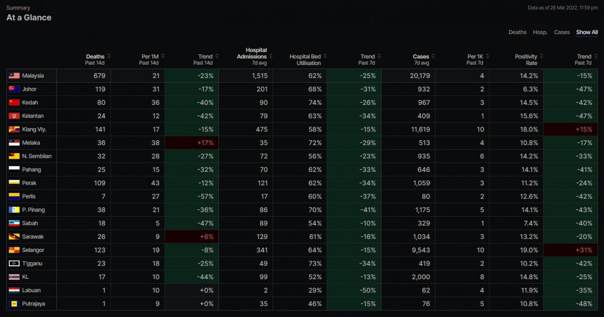
While you can zoom in to inspect each individual cell, just the extensive presence of green in every trendline category tells you all you need to know if you take the table’s “At a Glance” title literally.
As Malaysia now moves to reopen its borders and take additional steps towards reclaiming a most welcome sense of normality after over two years of pandemic-fuelled restrictions, it’s encouraging to see the public health data supporting the moves.
"ExpatGo welcomes and encourages comments, input, and divergent opinions. However, we kindly request that you use suitable language in your comments, and refrain from any sort of personal attack, hate speech, or disparaging rhetoric. Comments not in line with this are subject to removal from the site. "