


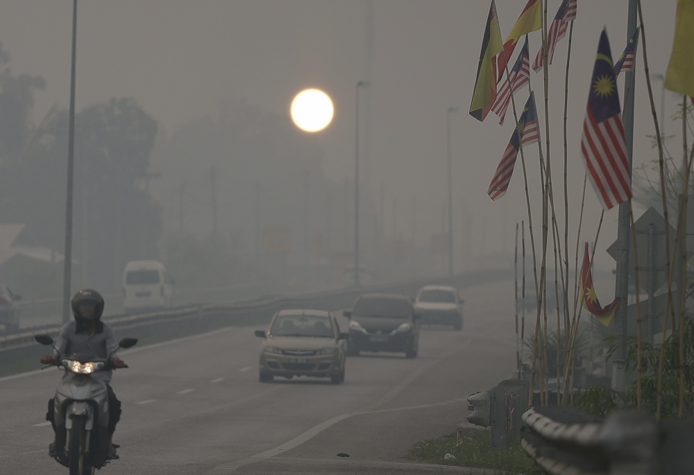
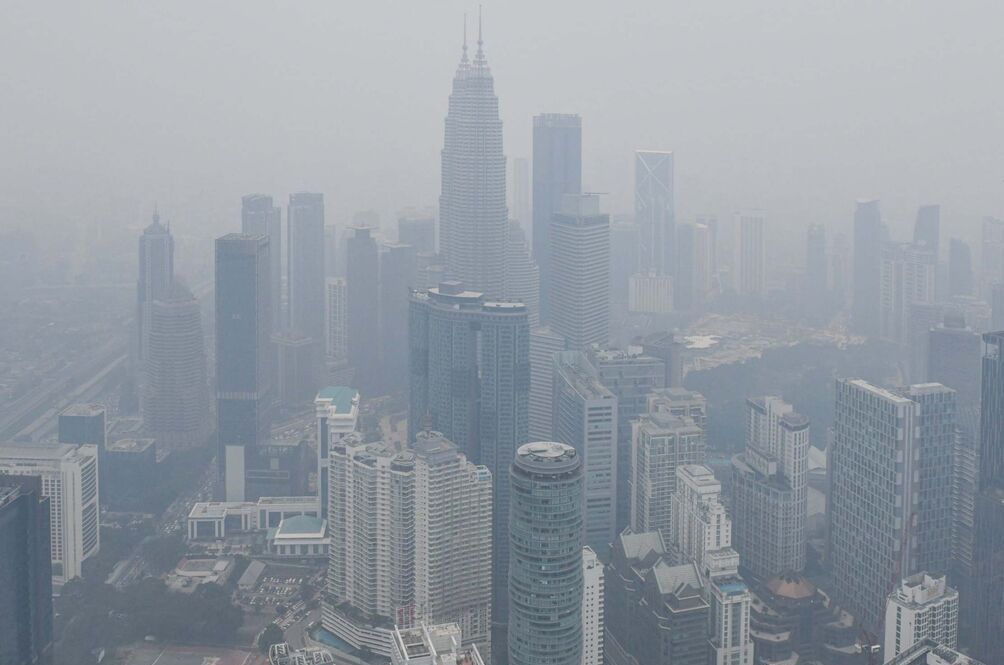
Malaysia uses its own Air Pollutant Index to communicate air pollution risks, a system rooted in a decades-old regional framework. But how does it compare with the US EPA’s more widely used AQI – and does Malaysia’s system understate the health risks of polluted air?
Air pollution is reported through numbers that are generally intended to make something invisible and potentially dangerous easier to understand. But the same measured concentration of a pollutant can produce a rather different message depending on which system is used to interpret it.
In this article, we will look at two different indices – one used by Malaysia and the other used on a relatively more international scale – side by side, examining how each converts the same pollutant concentration measurements into health-risk categories, where their thresholds differ, and what those differences mean for anyone trying to judge whether the air they are breathing is safe or not.
THE INDEX ISN’T QUITE WHAT IT SEEMS
When Malaysians check the air quality on a hazy morning, the number they usually see is the Air Pollutant Index (API), the system used by the Department of Environment (DOE) to turn measured concentrations of pollutants into a single, relatively easy-to-understand number. The API ranges from 0 to 500-plus, with 0–50 classified as “Good,” 51–100 as “Moderate,” 101–200 as “Unhealthy,” 201–300 as “Very Unhealthy,” and anything above 300 as “Hazardous.”
There is another index that is more widely adopted by many globalized weather apps and news sites, the Air Quality Index (AQI). It is tempting to describe this alternative as a “global AQI,” but that would be misleading. There actually is no single worldwide Air Quality Index with one universally accepted set of breakpoints. The term AQI is used by various national and regional systems. For the comparison that matters here, the US Environmental Protection Agency’s AQI is the most useful benchmark, because Malaysia’s API was itself developed from the US EPA’s earlier Pollutant Standard Index and, according to the DOE, closely follows that system.
Malaysia adopted the API in 1996, following an earlier Malaysian Air Quality Index developed in 1993, partly with the aim of harmonizing air-quality reporting across ASEAN. The system was designed primarily as a public-information and health-alert tool, rather than as a direct statement of what constitutes medically safe air.
Understanding that distinction is important, less so as a critique of one index over the other, but more so because the science has moved on considerably since the API was created.
THE SAME µg/m³ CAN YIELD A DIFFERENT MESSAGE
The underlying measurement is straightforward. Instruments at Malaysia’s monitoring stations measure the concentration of pollutants in the atmosphere, including PM₂.₅ and PM₁₀, in micrograms per cubic metre (µg/m³). A cubic metre of air containing 35 micrograms of PM₂.₅, for example, has a PM₂.₅ concentration of 35 µg/m³.
(As a note, these two measurements refer to different size fractions of airborne particles. PM₁₀ includes particles up to 10 micrometres in diameter, while PM₂.₅ measures the much finer particles no larger than 2.5 micrometres – just one-quarter the diameter of the largest PM₁₀ particles. To put that into perspective, a human hair is typically around 50–100 micrometres wide, meaning a 2.5-micrometre particle is roughly 20–40 times narrower than a human hair. Because these particles are so small, PM₂.₅ can penetrate much deeper into the lungs than larger particulate matter, with some particles or their components capable of entering the bloodstream. This is why fine particulate matter is generally considered the more significant health concern, particularly during prolonged periods of haze or combustion-related pollution.)
Each of the two indices then take that concentration and convert it into a numerical sub-index. Each pollutant has its own concentration breakpoints, and the pollutant producing the highest sub-index becomes the reported API or AQI. Malaysia currently uses six pollutants in its API: PM₂.₅, PM₁₀, ozone, carbon monoxide, nitrogen dioxide, and sulfur dioxide.
The US EPA’s current AQI, meanwhile, puts a 24-hour PM₂.₅ concentration of 0–9.0 µg/m³ in its “Good” band, 9.1–35.4 in “Moderate,” 35.5–55.4 in “Unhealthy for Sensitive Groups,” and 55.5–125.4 in “Unhealthy.”
Malaysia’s framework produces a noticeably different public-health message because its bands and underlying concentration breakpoints do not map directly onto those categories. More importantly, the Malaysian system was built around older national guidelines and a regulatory framework that has subsequently been tightened in stages.
Malaysia’s current Ambient Air Quality Standard sets a 24-hour PM₂.₅ target of 35 µg/m³, with interim targets of 75 and 50 µg/m³ introduced before the final 2020 standard. That is substantially higher than the World Health Organization’s 2021 guideline of 15 µg/m³ for the same averaging period.
IS MALAYSIA DELIBERATELY MAKING POLLUTION LOOK SAFER?
This is where the story becomes more complicated than simply saying Malaysia chose a “looser AQI.”
There is no evidence that the API was deliberately designed to make polluted air appear healthier. Its origins are much more prosaic: Malaysia adopted a system based on the US PSI in the 1990s, adapted it to local pollutants, standards, regulatory requirements, and the need for a straightforward public warning system that could inform without causing undue panic.
A much more legitimate criticism is that the scientific reference points have changed faster than the public-facing language of the index. The WHO’s latest guidelines explicitly reflect evidence that health effects occur at substantially lower concentrations than previously understood. Its 2021 guideline for 24-hour PM₂.₅ is 15 µg/m³, compared with Malaysia’s 35 µg/m³ standard.
So, while it would be unfair and probably incorrect to call Malaysia’s API a deliberately misleading system, there is a strong case for asking whether its categories and thresholds remain sufficiently health-protective. An API reading is useful for understanding relative pollution levels and official response thresholds, but it should not be mistaken for a declaration that air below a particular number is harmless.
That is perhaps the more important point for anyone checking the haze forecast: the number is intended primarily as a communication tool, not a magic line between healthy and unhealthy air.
Sources: Department of Environment Malaysia; US Environmental Protection Agency; World Health Organization; Malaysian Ambient Air Quality Standard